
KleverSuite
2024 - 2025 • Product Design
Impact
8 Clicks → 2 Clicks
Transitioning between Tasks and Wiki documentation
Reduced Context Switching
Shorter, focused pathways to move across Klever
Improved productivity
Features adopted rapidly by internal members
Product Context
Klever is an internal, all-in-one project management ecosystem designed to synchronize technical documentation, contract scope, agile workflows, and daily task management through three modular apps: Wiki, Projects, and ToDo. It serves as the backbone for Tokyo Techies, where engineers, project managers, and human resources manage client projects, internal projects, and all related confidential documentation.
Role and Team
I joined as the sole designer to lead the redesign of Klever and its surrounding research initiatives. I worked closely with two engineers and the product owner, Bennie, who was also the lead full-stack engineer.
Our CEO at Tokyo Techies gave us four-months to overhaul the platform and get it to standard to our team members, project managers, and sales team—all of who are daily users of Klever and have uniquely specific needs.
Product Owner: Bennie Nguyen
XFN Partners: Engineers, Product Owner
Stakeholders: Fellow Tokyo Techies employees
Problem Statement
KleverSuite’s fragmented architecture and inconsistent navigation across its three core apps slowed daily workflows, limited cross-project visibility, and significantly increased the risk of costly client mistakes when teams lost track of the single source of truth.
Research Findings
Before jumping into a redesign, it was important for the team to know what exactly to focus on. Should we add quality-of-life features? Unify the user interface? Maybe we should keep the design as-is and just refactor the backend to perform more reliably.
To confirm Klever’s primary pain-point, I conducted a 3-week research phase that began with a company-wide survey, followed by a usability test with 9 members from the company.
Participants included division leads, project managers, sales persons, engineers, and human resources.
75% of users experienced frustrations with Klever on a daily basis, 60% of which relate to navigation.
Users typically had 6-10 instances opened at once, because switching pages within a single instance was too slow.
90% of users did not know Klever had a bookmark feature.
It took 8-9 clicks to move from a Task to a related Wiki document.
Users reported feeling chronically 'unsure' when navigating between and within apps in Klever.

Iteration 1: Full page with an expanded sidebar and a Wiki document
Relying on browser bookmarks, multiple tabs, and multiple desktops was especially cumbersome for engineers, since their desktops were already occupied with IDEs, multiple terminals, Slack, and documentation.
Over time, this led to a larger problem: source-of-truth documents for long-term projects were often lost or recreated under the assumption that they did not already exist.
Current Design
Klever lacked a central homepage. Instead, it functioned as three separate applications connected only by a dropdown menu in the top navigation bar.
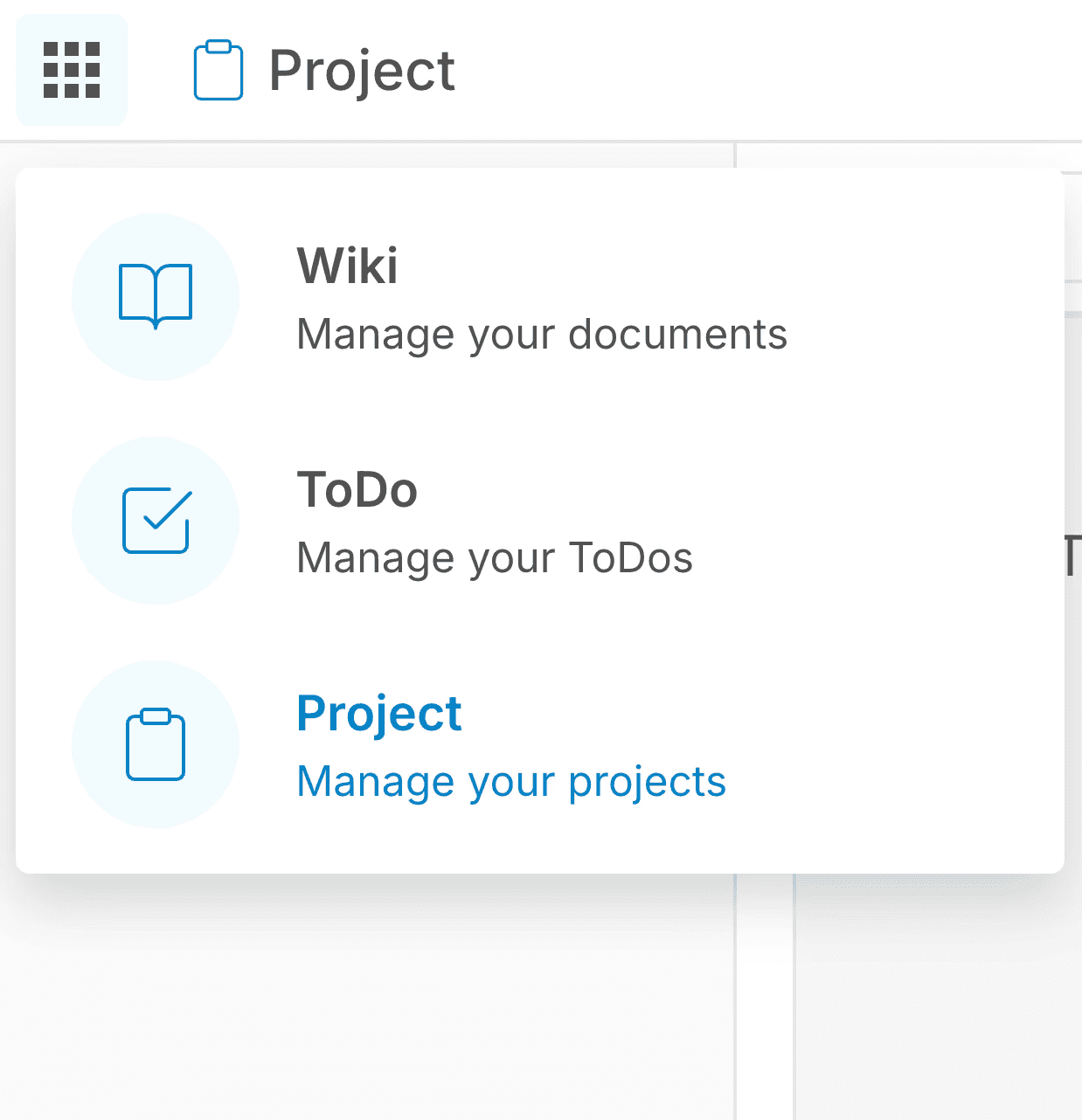
Moreover, the Wiki and Project apps shared the same homepage interface—a grid of cards—but did not share or link any underlying data. Each card represented a workspace that held either documents in Wiki or tasks in Project. However, creating a new workspace in one app does not create a corresponding one in the other; it had to be recreated manually.
The ToDo app was simply an aggregated list of a user's tasks across multiple Project workspaces.
Because these homepages were visually identical, day-to-day navigation became error-prone. Once inside of the app, they all had their own sidebar variations, which made muscle-memory difficult to develop.

Klever Wiki's original homepage design populated with mock Workspaces.


Left to right: Wiki's original sidebar, Project's original sidebar, ToDo's original sidebar
Goal
The objective of this redesign was to reduce the number of clicks, time spent, and context switching required to move from a task in a Kanban board to a nested document in a Wiki workspace.
By streamlining this workflow, the redesign aimed to reduce cognitive latency and make navigation within Klever faster and more intuitive.
Stakeholder Alignment
Across four solutions, I worked closely with each stakeholder and XFN group to gather feedback, surface constraints, and iterate toward solutions that balanced their needs, technical feasibility, and long term direction.
Solution Proposal 1: System Architecture Change
Transform Klever from a collection of fragmented tools to a unified workspace-centric platform. By consolidating tasks, documents, and settings into a single workspace, we reduce context switching and cognitive overload, and offer a persistent navigation layer that supports the workflows of team members and project managers.
How this works
At the moment, each app holds a Workspace, which then contains either tasks or documents.
The idea was to switch this hierarchy: allow a single workspace to hold both tasks and documents.
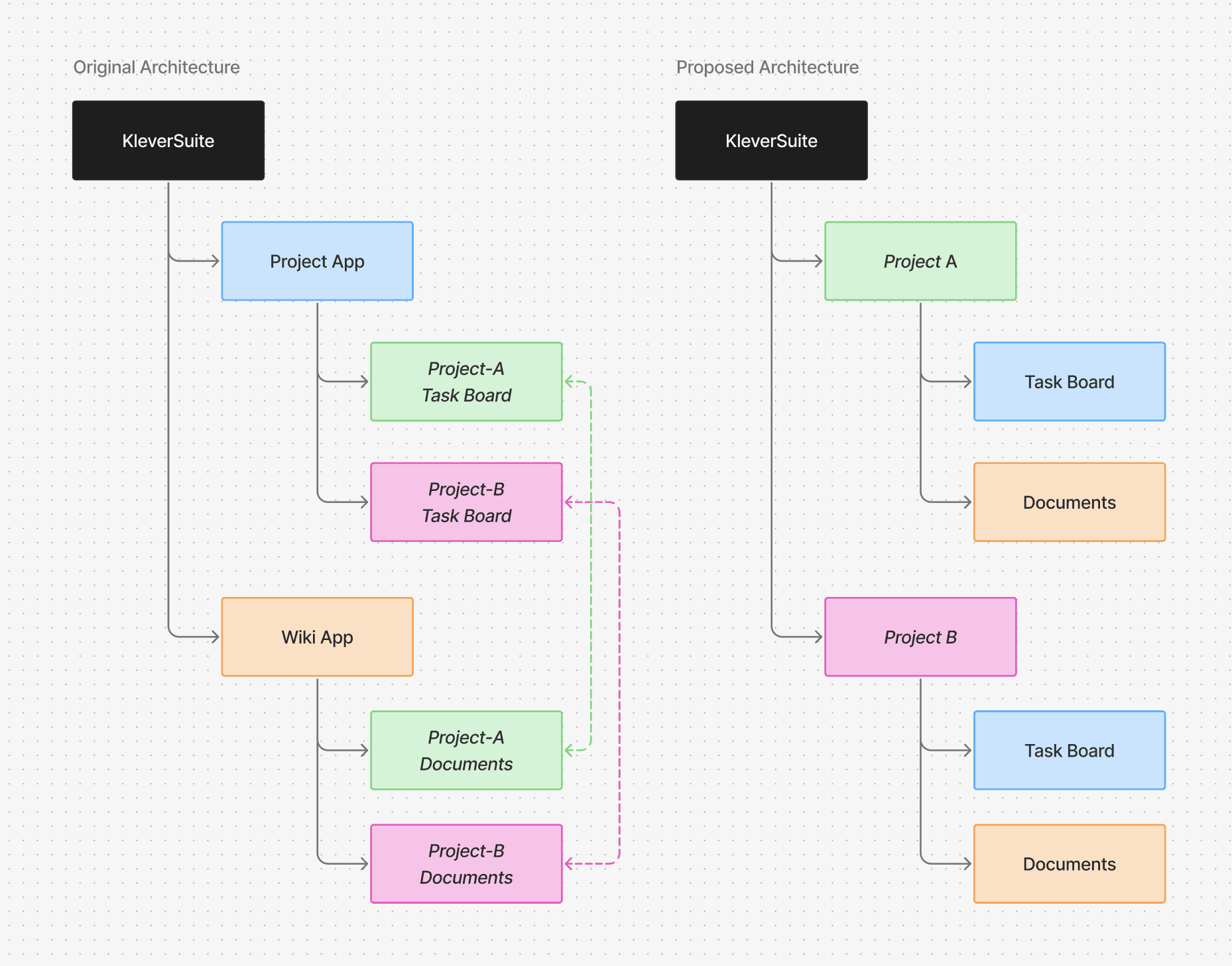
Solution Proposal 1: Architecture Refactor Diagram
Engineers: Allocation Constraints
While the team agreed this would offer the ideal user experience for Klever, implementing it would have required a significant refactor of the backend architecture. Given limited time and engineering resources, we needed to pursue a solution that could work within the existing system structure.
Solution Proposal 2: Combined Homepage
Here, I explored merging the grid views of the Wiki and Project apps, allowing both types of workspaces to appear in a single view that users could filter accordingly. Each card would be color-coded, similar to how Figma distinguishes Design, FigJam, and Slides files.
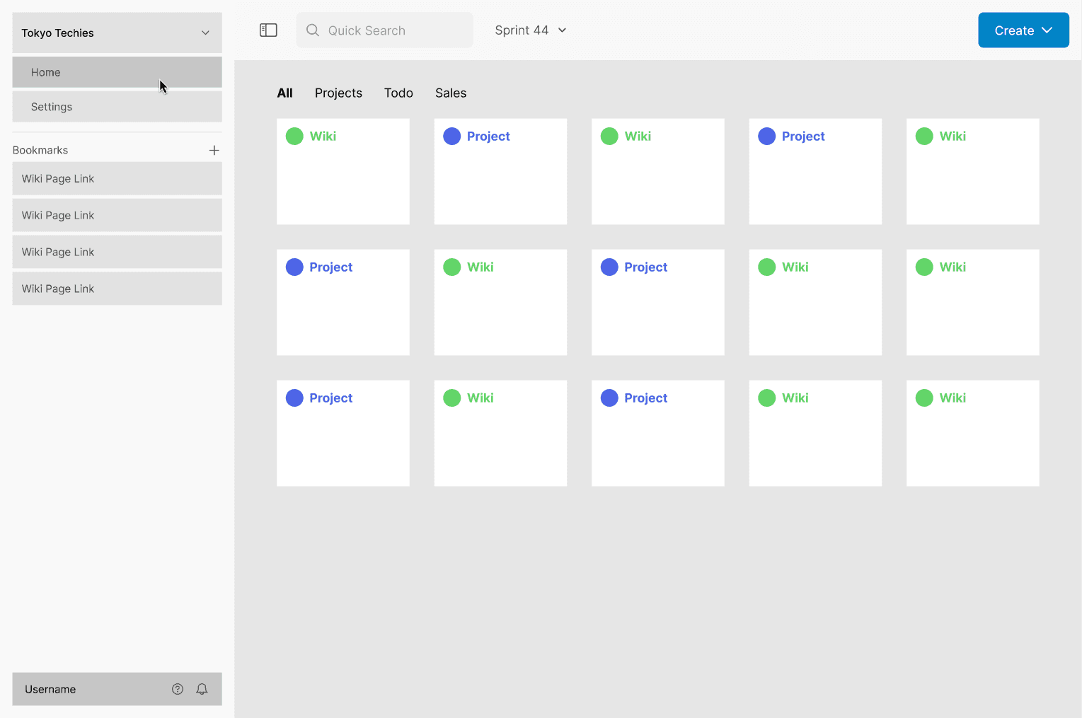
Solution Proposal 2: a low-fidelity outline of a singular, combined homepage and color-coded workspaces
Project Managers: Speed Concerns
While this was a significantly more feasible for developers than the previous idea, company team members still found the user experience to be clunky. Ideally, they noted, users should be able to move from a project to a wiki workspace without having to return to the homepage.
De-emphasizing the Homepage
To further reduce friction when switching between apps and workspaces, I reimagined the sidebar as a central “home” for navigation. While a homepage still exists, shifting emphasis to the sidebar allows users to move more quickly between workspaces without needing to route through the homepage.
Solution Proposal 3: Multi-Level Sidebar
Inspired by Figma’s sidebar navigation, I designed a multi-level sidebar with a static primary navigation and a dynamic, app-specific section.
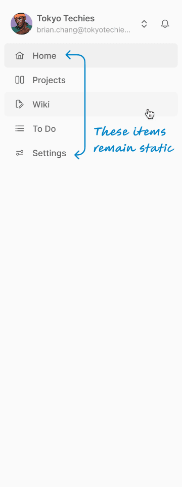
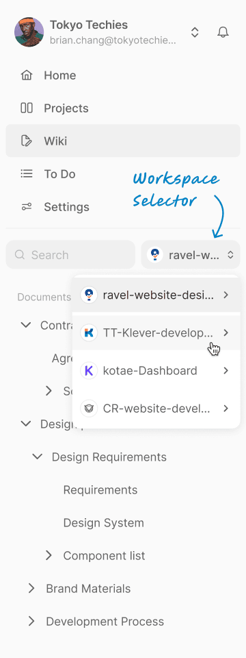
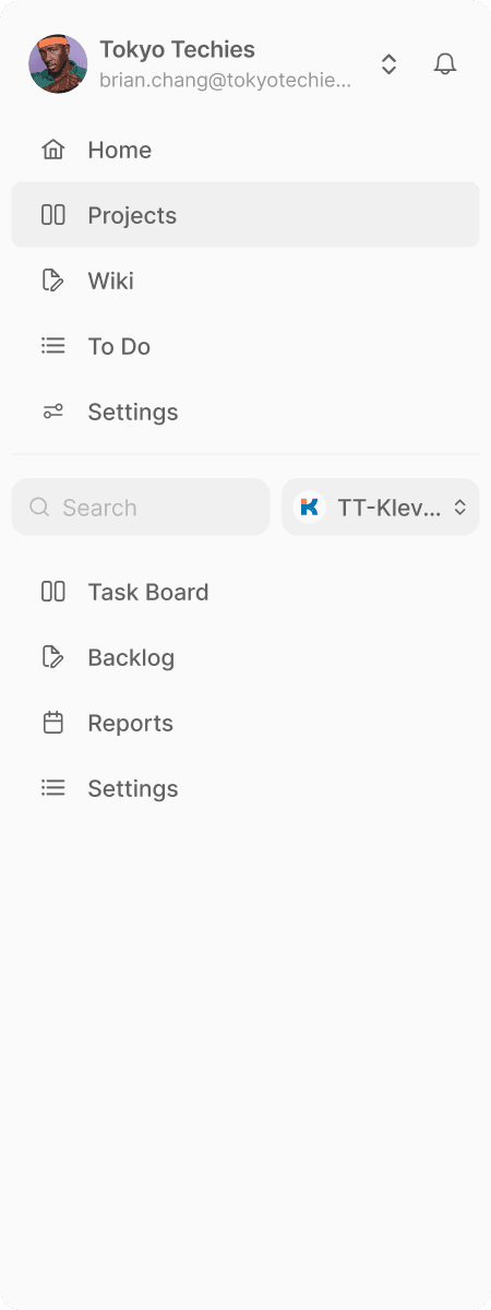
Left to right: Home sidebar, Wiki sidebar with Workspace selector, Project sidebar
What worked
Each app and a quick workspace-switcher permanently visible in the sidebar reduced navigation time, and provided a clear direction for users looking to switch apps.
What didn’t work
A single sidebar limited future scalability, added clutter, occupied the space intended for Bookmarks, and continued to confuse users since it was not an entirely consistent sidebar.
Product Owner: Roadmap Concerns
It was important that Klever's sidebar left room for growth. While considering this new user experience, Bennie was also planning to add a few more apps such as Chats, Calendar, and Sheets in the future. With this in mind, I proposed splitting the dynamic sidebar content off into a secondary sidebar, leaving the primary panel fixed and persistent.
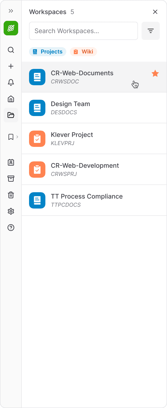
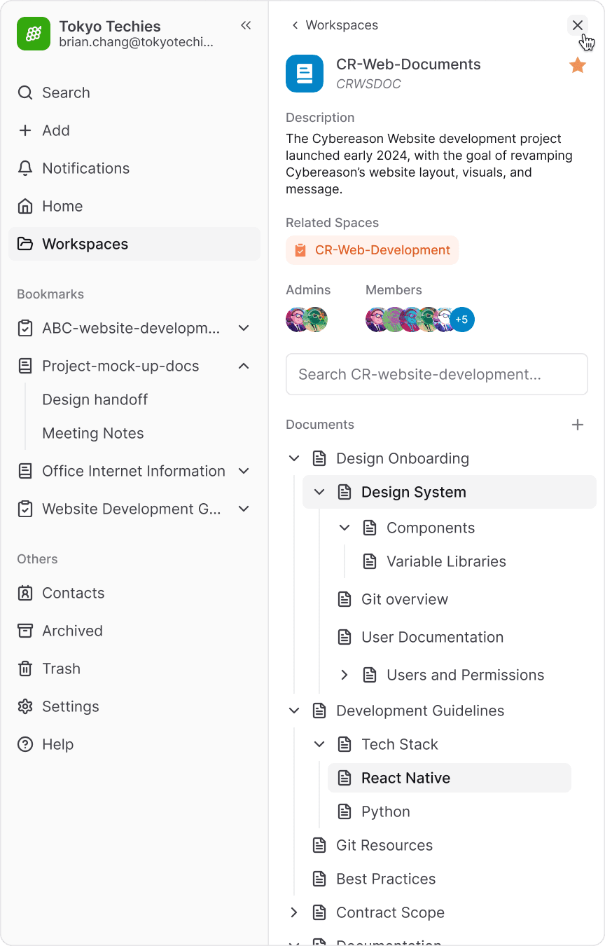
Approved Solution: Dual-Pane Sidebar
This fourth and final iteration introduces a dual-pane sidebar, inspired by patterns used in Apple Notes, Apple Mail (desktop), and Slack.
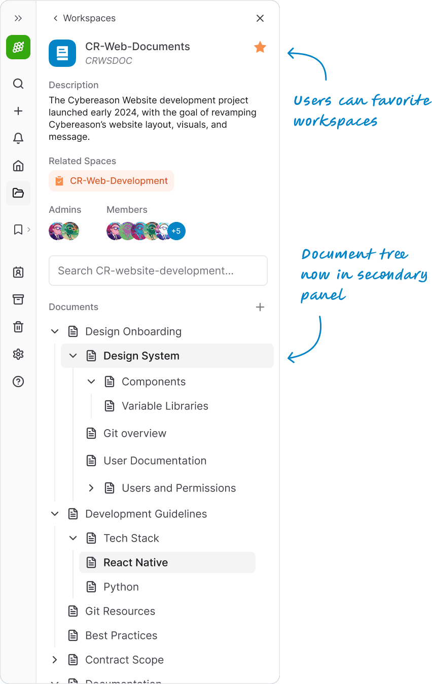
This separation keeps the primary sidebar focused on core navigation and a new bookmarks section, while the secondary sidebar adapts to specific needs for each app, such as document trees, settings, and notifications. It provides room to surface previously buried information such as workspace descriptions and members, and enables a new feature to link related spaces for quick navigation.
The result is a cleaner interface with more intuitive cross-app navigation. Users can switch workspaces without leaving their current view, while the primary sidebar remains scalable for future apps.

Approved solution: Dual-pane sidebar, fully opened
Workspaces
Both workspace types are remain color-coded and now grouped under a single “Workspaces” sidebar item, which opens a filterable list in the secondary panel.
Bookmarks
By adding bookmarks readily available in the sidebar, it kept all important documents, contract details, scopes, and documentation in the corresponding contexts of each workspace, and all within a single Klever instance. This significantly reduced the amount of tabs opened simultaneously for project managers and leads.
Approved solution interaction: Selecting a Wiki

Approved solution: Collapsing the dual-pane sidebar
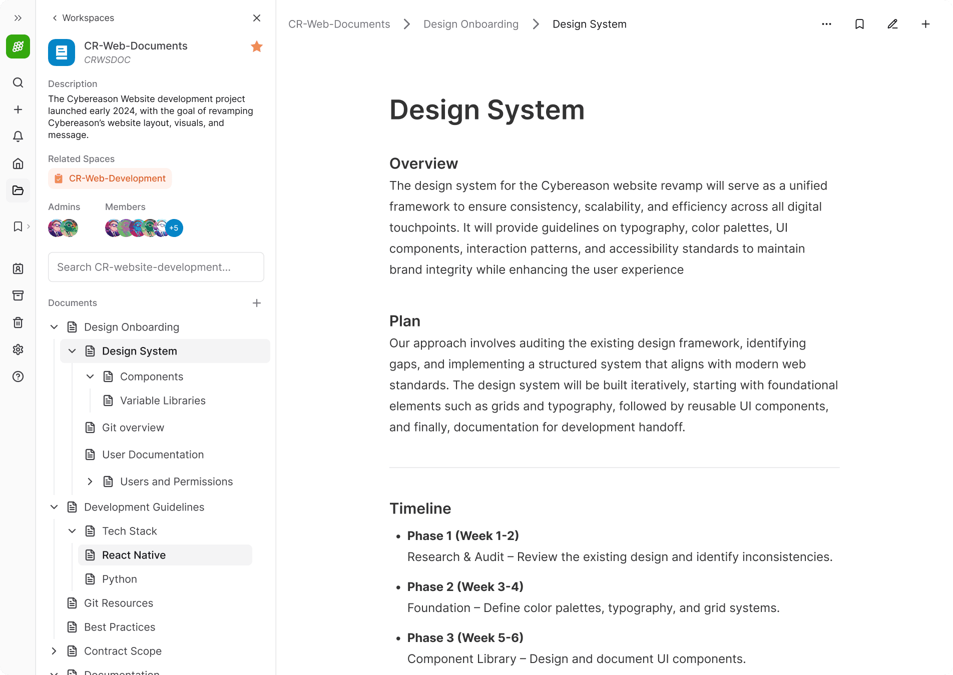
Final Iteration: Full page with focused wiki sidebar
Use Cases
The secondary sidebar provided space for new features while remaining a consistent, reliable, and familiar element.
For example, the notifications panel allowed users to see a more content at a glance., keeping alerts accessible while maintaining a clean and organized main workspace.
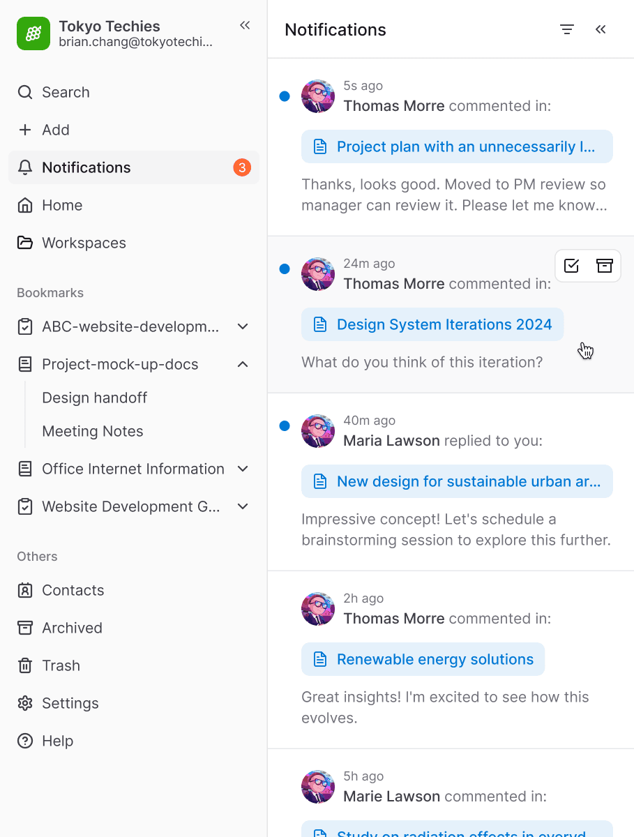
Final Iteration: Secondary sidebar opened with Notifications
Impact and Validation
The primary success was the reduction in navigation speed. Where users previously spent 6–7 seconds (8-9 clicks) (with the assumption that they are familiar with the route) to bounce between a task and its related wiki document, the new sidebar reduced that journey to just 1–2 seconds (2-3 clicks).
Beyond the speed, the majority of the team began using Bookmarks immediately. Leads and project managers who engaged with a lot of documentation noted that the "Related Workspaces" was their favorite new feature, making the overall experience feel significantly more stable and comfortable for multi-tasking and productivity
Takeaways
Working on a fast-paced, resource-constrained project, I learned how to pursue strong UX solutions within the limitations of an imperfect backend architecture. I collaborated not only with engineers, but with teammates across the entire company who helped give feedback throughout the design iterations.
This ended up being some of the most fun and rewarding work I’ve done, largely because I now see my teammates using the product every day.