
WorkSpace
2025 • Product Design
Role and Team
In early 2025, Tokyo Techies was approached by a private university in Japan to develop closed-network app for their students. This is a place where students can find job-postings from partnering recruitment agencies, connect with alumni, or hear about campus-wide events.
I was given 48 hours to build a click-through prototype, in both English and Japanese, to present to the University’s president. Following are related Stakeholders as XFN groups:
XFN Groups:
Duc Doba, CEO of Tokyo Techies (leading Sales for this project)
Bennie Nguyen, Solutions Delivery Head
FE and BE Engineers
Stakeholders:
President of Japanese University (redacted due to NDA)
Problem Statement
The challenge was to translate a vague vision for a Japanese university's closed-network, social-professional networking platform into a high-fidelity, dual-language prototype within 48 hours to secure a high-stakes partnership with the University President.
Requirements
The president sought after a prototype of what the student’s mobile experience with the following requirements:
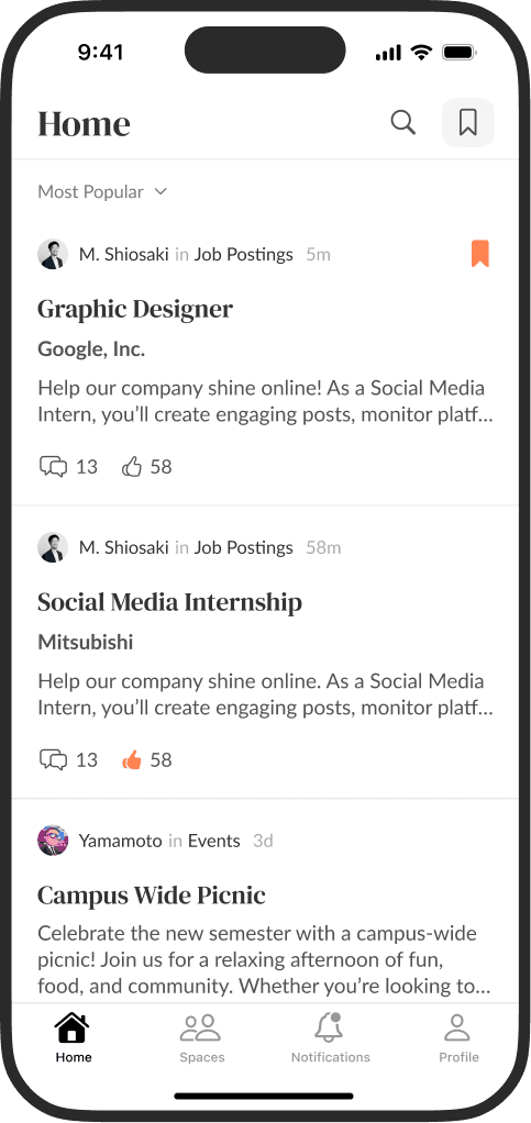
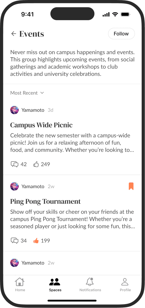
Enable students to follow Spaces, a community forum where university admins, professors, and recruiters share posts.
Providing student profiles that highlight their major, GPA, and bio. This should tend to cultural differences between the U.S and Japan.
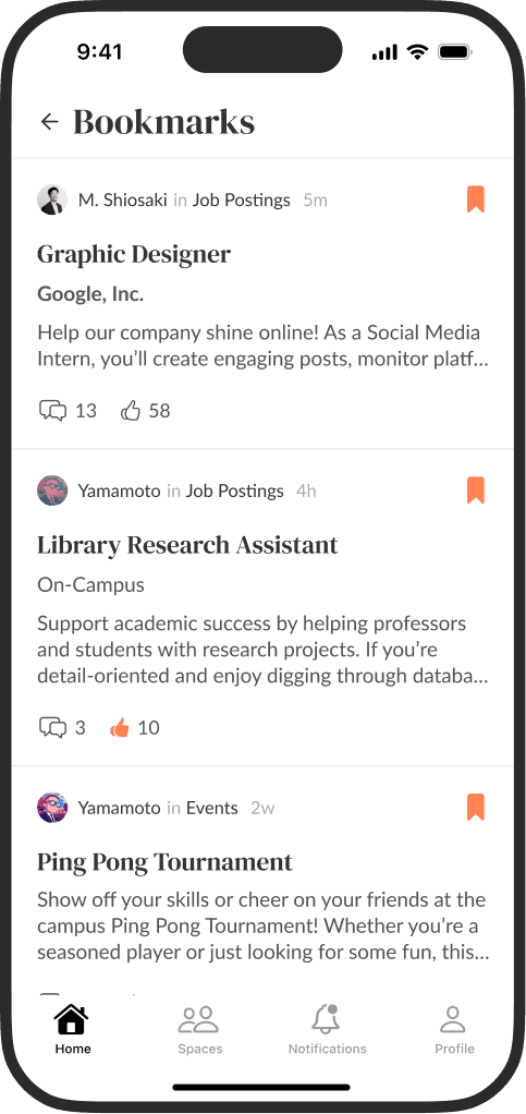
Support familiar social features such as comments, replies, likes, bookmarks, and notifications.
Offer a “Western-style” aesthetic to appeal to international students while maintaining a local experience for Japanese students.
Stakeholder Alignment
The 48-hour sprint required an immediate alignment of three high-stakes perspectives to ensure the final pitch was both visionary and viable.
CEO & Solutions Delivery Head: Speed Concerns
The CEO and Solutions Delivery Head identified this university partnership and project as an important opportunity for the agency. I was selected for this project for my ability to deliver high-fidelity screens in a short amount of time. I used the iOS 18 Figma component library to build quickly, ensure the prototype was visually polished, and keep it feasible for React Native implementation should development proceed afterward.
President of Japanese University: Large Vision
I worked to systematically alongside project leads to prioritize the critical "must-have" social-professional features, such as Spaces and Student Profiles, while deferring secondary ideas like Direct Messaging or the backend (staff, alumni, recruiters, etc.) posting experience for later phases.
Engineers: System Architecture
Networking applications can quickly become complex when managing user profiles, nested threads, organization pages, and forums. I briefly consulted on the feasibility of the proposed “Spaces” architecture to ensure the design could be implemented within the university’s existing closed-network infrastructure.


Design Strategy
Designing for a Japanese university required a careful balance between the "Western-style" aesthetic and the expectations of local users. I noticed that Threads and Twitter were popular apps in Japan, so I took inspiration from its user interface to keep the app familiar to users. Additionally, I took inspiration from the typographical style of Medium, and the basics of information architecture from Reddit.

Components
Limiting the palette to 3–4 shades of gray and a single accent color made it possible to present low-fidelity concepts with a more polished appearance.
By leveraging the Apple iOS 18 / iPadOS 18 Figma library, I only needed to create a small set of custom modular components for the prototype.
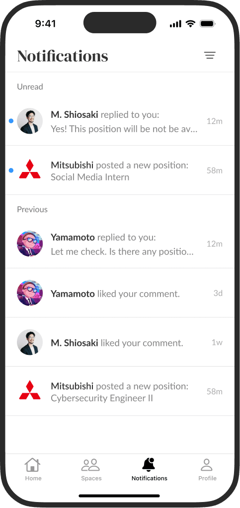
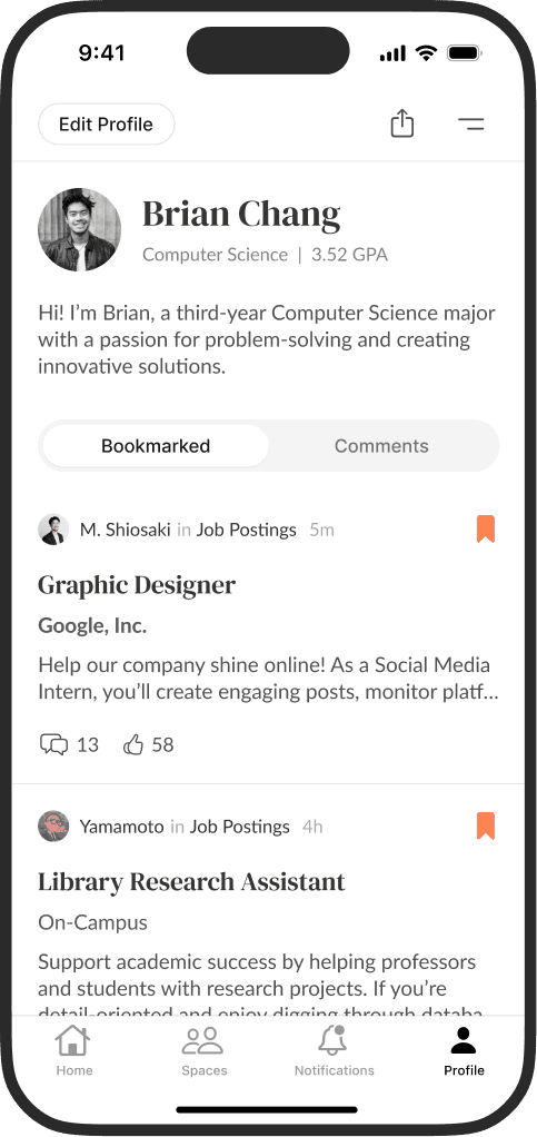
Left to right: Home, Spaces, Notifications, and Proflile

Localization
While the platform is designed primarily for the University in Japan, many participating employers recruit for English-speaking roles. So, student profiles can display both grading conventions. Japanese students often display evaluative rankings (秀 / 優 / 良 / 可), while Western students typically present a GPA.
Mock data and translations were accomplished with Google Gemini.
Visual Segregation
The app contains several list-based views, including spaces, posts, notifications, and users, so each item needed to remain easily distinguishable within dense lists.
To support this, I used subtle dividers, typographic hierarchy, and profile imagery to create clear visual separation between items.
To remain lightweight and quick to use, key features, major views, and nested threads were provided redundant navigation pathways.

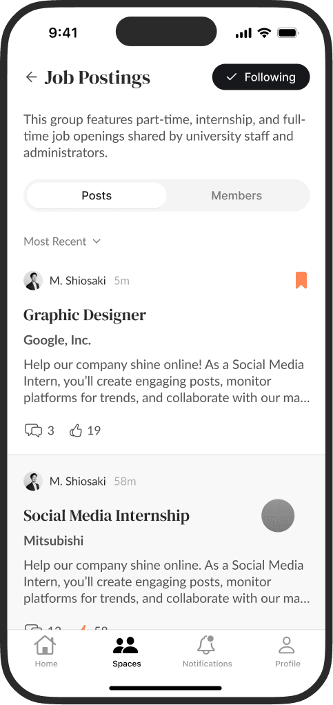
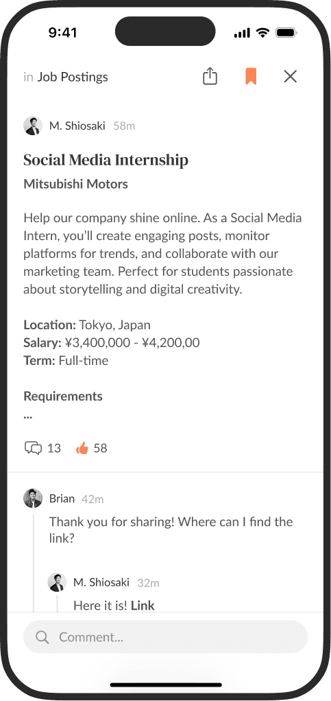
Left to right: Spaces, Job Postings, Post
Presentation
The board expressed high satisfaction with the fidelity of the work, specifically praising the integration of Spaces, the familiarity of the navigation patterns, and the implementation of basic social media features.
The click-through prototype served as the primary source of truth during monetization negotiations, providing the board with a concrete visualization of their product idea.
Project Conclusion
While the design successfully validated the student-experience vision and functional requirements, the partnership reached a stand-still during negotiations. As a result, both parties decided not to move forward with the build at that time.
Final Thoughts
Given more time, I would have expanded the prototype with additional interactions, an onboarding flow, direct messaging, company profiles, and a clear differentiation between the poster's (staff, alumni, or recruiters) user experience and the student's user experience.
This project pushed me to work quickly, make decisive trade-offs, consider cultural nuances, and translate vague requirements into a functional prototype within a tight timeframe.
Designing within a two-day sprint was one of the most energizing projects I’ve worked on. I’m grateful for the creative ownership over both the interface and experience, and for the opportunity to contribute to a high-stakes initiative.